Talk to Us (219) 924-9779
Blog
March 09, 2026
What Goes Wrong When You Enlarge a Design for Large-Format Printing?
You have a big event coming up and need a banner that makes a statement. You’ve already got some great designs from your flyers and social media posts, so you figure you can just send one of them to the printer, tell them to make it bigger, and call it a day. Simple, right? Unfortunately, it’s not that straightforward.
At Lithographic Communications, we’ve spent over 35 years mastering the nuances of large-format printing. Through countless projects, we’ve seen the same challenges arise when designs aren’t created with scale in mind. Here’s what typically goes wrong:
- Images become pixelated and blurry
- Fonts turn unreadable from a distance
- Colors shift and appear dull
- Design elements lose their visual punch
- Layouts fail to scale proportionally
Understanding these issues before you print can save you time, money, and frustration.
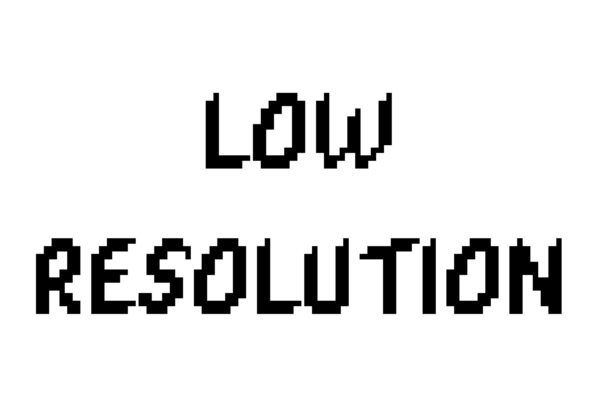
Why Does My Design Look Blurry When It’s Blown Up?
Resolution is the culprit here. Think of your image as a puzzle made of tiny colored squares called pixels. When you create a design for a business card or Instagram post, you’re working with a small canvas that doesn’t need many pixels. Enlarge that same image to banner size, and those pixels get stretched apart, creating a blurry, pixelated mess.
This problem stems from DPI (dots per inch). Small-format designs often use 72 DPI, which looks fine on screens. Large-format printing requires at least 150 DPI to maintain clarity. Trying to stretch a 72 DPI image across a billboard creates the same effect as zooming in too far on a photograph.
The ideal approach is to start with high-resolution images from the beginning. Collaborate with a professional who understands the technical needs of large-format printing.
Why Are My Fonts Hard to Read on a Banner?
Font size matters, but it’s not the only consideration. When you enlarge a design, intricate script fonts or thin typefaces can become illegible, especially from a distance. What looked elegant on a postcard turns into a squinting contest on a banner.
Viewing distance plays a critical role, too. A banner hung 20 feet in the air needs bolder, simpler fonts than one displayed at eye level. Delicate serifs and decorative flourishes disappear when viewed from across a parking lot.
Consider these font guidelines for large-format printing:
- Choose bold, sans-serif fonts for maximum readability
- Avoid overly decorative or script fonts
- Test your design by viewing it from the intended distance
- Increase font weight rather than just size
If you’re still unsure, print a scaled-down version of your banner and view it from proportionally farther away. If you can’t read the text, it won’t work at full size either.
Why Do the Colors Look Different on My Banner?
Color mode makes all the difference. Your computer screen displays colors using RGB (red, green, blue), which creates bright, vibrant hues through light. Printers use CMYK (cyan, magenta, yellow, black), which mixes physical inks to create colors. This fundamental difference means what you see on screen won’t always match what appears on paper or vinyl.
RGB colors also contain shades that CMYK simply cannot reproduce. That electric blue or neon green that pops on your monitor? It’ll look noticeably duller when printed.
This issue affects all printed materials, but it’s especially noticeable with larger items, such as vinyl banners, because vinyl reflects light differently.
Color calibration requires professional equipment and expertise. Work with a printer that uses vibrant 6-color inks and advanced color-matching systems to reproduce your brand colors as accurately as possible.
Why Does My Design Feel Cluttered When It’s Scaled Up for Large-Format Printing?
Designs that work perfectly for smaller formats can feel chaotic when enlarged. A brochure might accommodate multiple images, several text blocks, and decorative elements because readers hold it close and can process detailed information. Scale that same layout to a banner, and it becomes visual noise.
Large-format designs demand simplicity. Viewers typically see banners from a distance and process the information in seconds. They can’t (and won’t) stop to decode a busy layout. Negative space becomes your ally here, giving design elements room to breathe and making your core message stand out.
Key principles for large-format layouts:
- Focus on one primary message
- Use ample white space around text and images
- Limit the color palette to three or four colors
- Remove non-essential design elements
- Prioritize hierarchy with size and placement
Think of a highway billboard. The most effective ones feature minimal text, bold imagery, and a clear message you can absorb while driving 65 miles per hour. Your banner should follow similar principles, adjusted for its specific viewing context.
Make Your Prints Big Without Making a Mistake
Scaling a design isn’t as simple as just enlarging it. Factors like resolution, color, readability, and layout can change significantly at larger sizes. If these details aren’t handled correctly, the final product may not have the impact you’re aiming for.
The good news? With proper planning and the right print partner, these issues are entirely avoidable.
At Lithographic Communications, we review your files, recommend adjustments, and check that your design is ready to perform at scale. Whether it’s a banner, sign, or oversized project, we’ll make sure it looks just as sharp at three feet wide as it did on your screen. Send your project our way today, and let’s get it right.
Why Choose
Lithographic
Communications?
Decades of Mastery
With 35 years in the industry, our experience speaks volumes, ensuring that every project is handled with unparalleled expertise.
Uncompromised Quality
We pride ourselves on delivering prints that meet the highest standards every single time.
Tailored to You
Our customization capabilities mean your vision is brought to life exactly as you imagined it, without any limitations.
Local Touch
Being locally based, we understand the nuances of the community and cater to the specific needs of our clientele.
Exceptional Service
Our mission is not just about printing; it’s about providing a seamless, hassle-free experience from start to finish.
Swift Execution
We recognize the importance of time in business. Our fast turnaround ensures you get your prints when you need them without delay.
Handling Complexity
Even the most demanding projects are a challenge we eagerly embrace, ensuring top-notch results no matter the intricacy.
Let Us Transform Your Vision
Into Paper & Ink!
"*" indicates required fields
The information on this website is for informational purposes only; it is deemed accurate but not guaranteed. It does not constitute professional advice. Testimonials are not a guarantee, warranty, or prediction of what your experience with us will be. By providing contact information, users acknowledge and give explicit consent to be contacted via the methods of communication provided, including SMS. Message and data rates may apply. Message frequency may vary. Reply STOP to opt out.
NUVEW | Copyright 2026 All Rights Reserved | Accessibility Notice | Privacy Policy